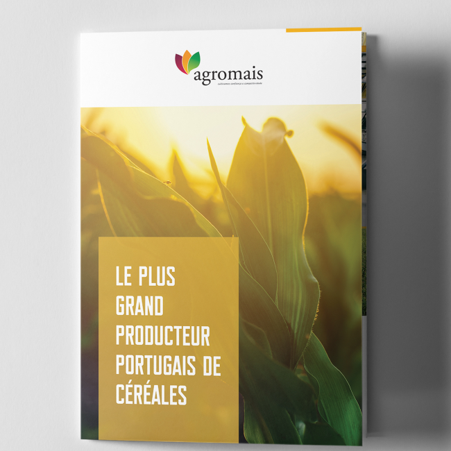

Symbology
—
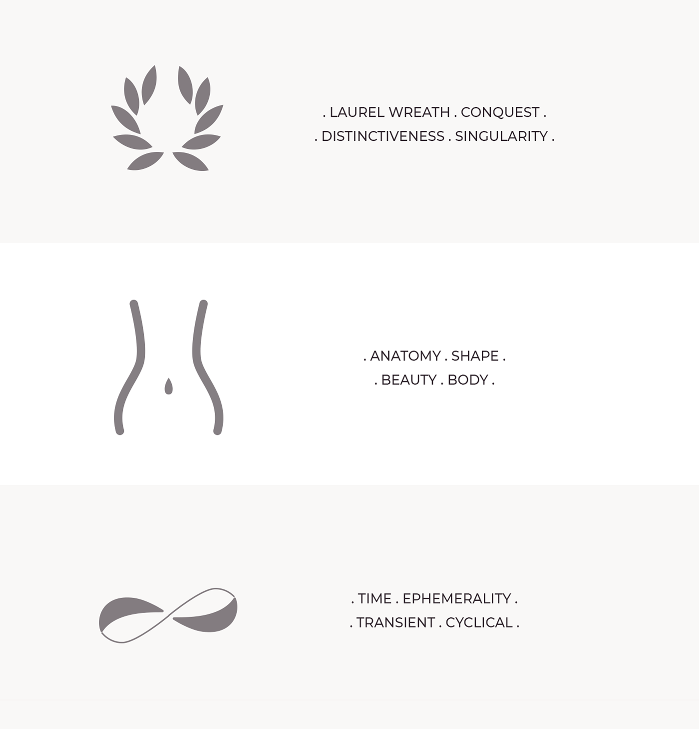
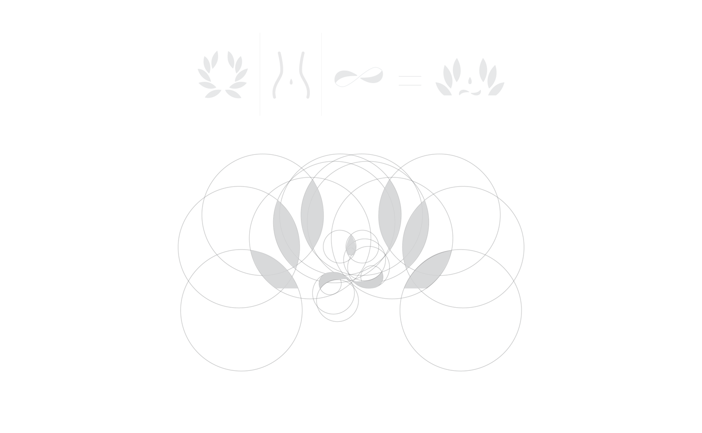
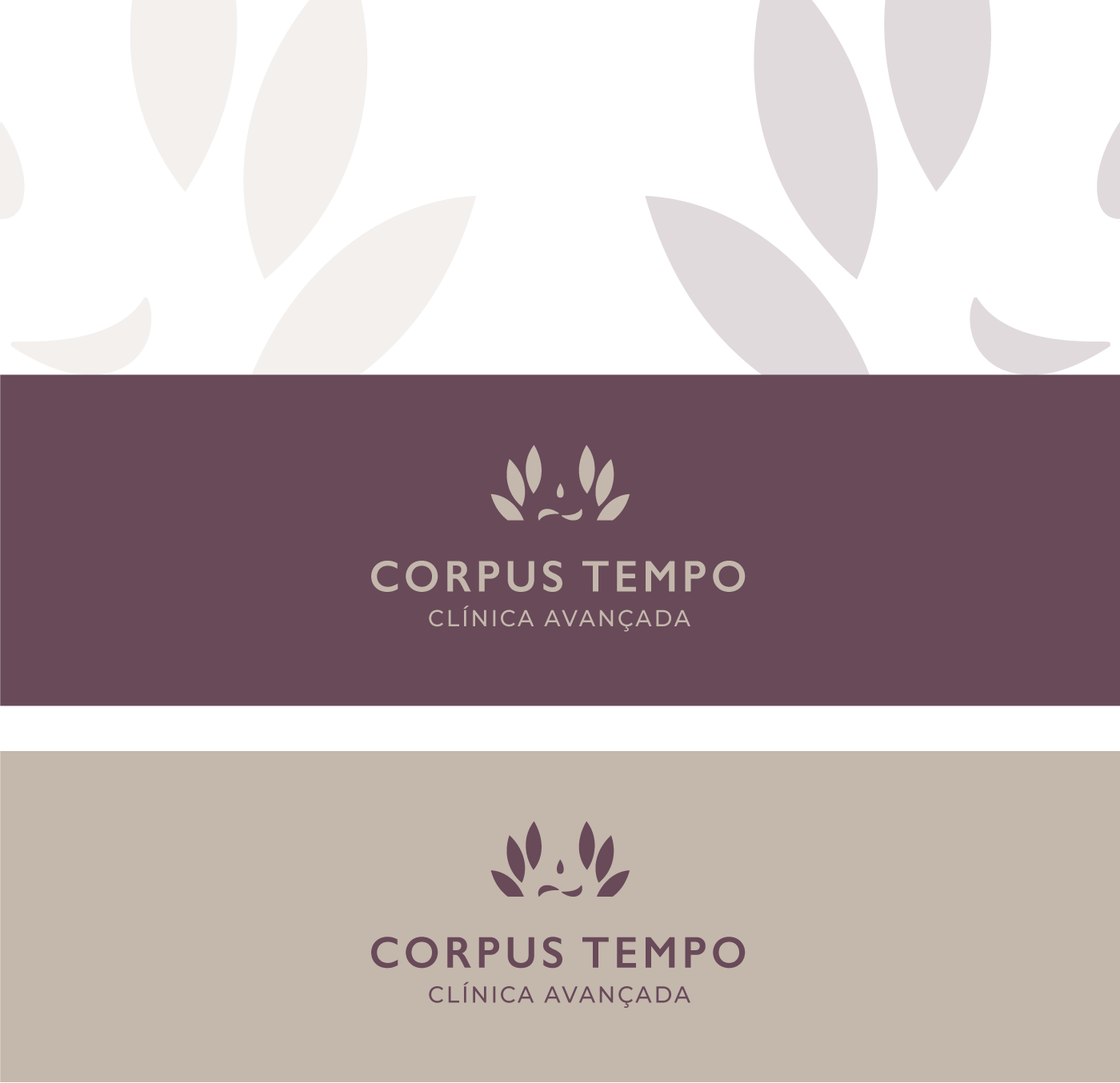
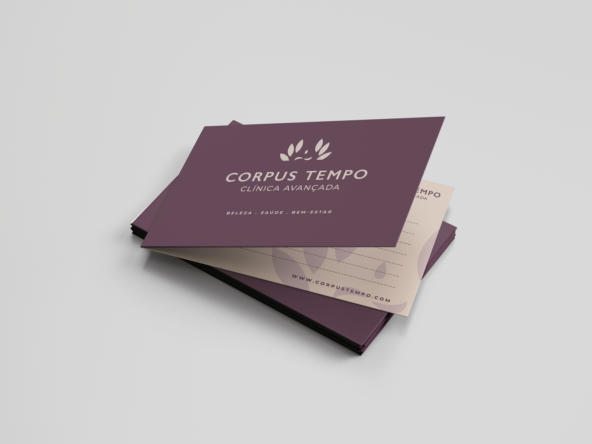
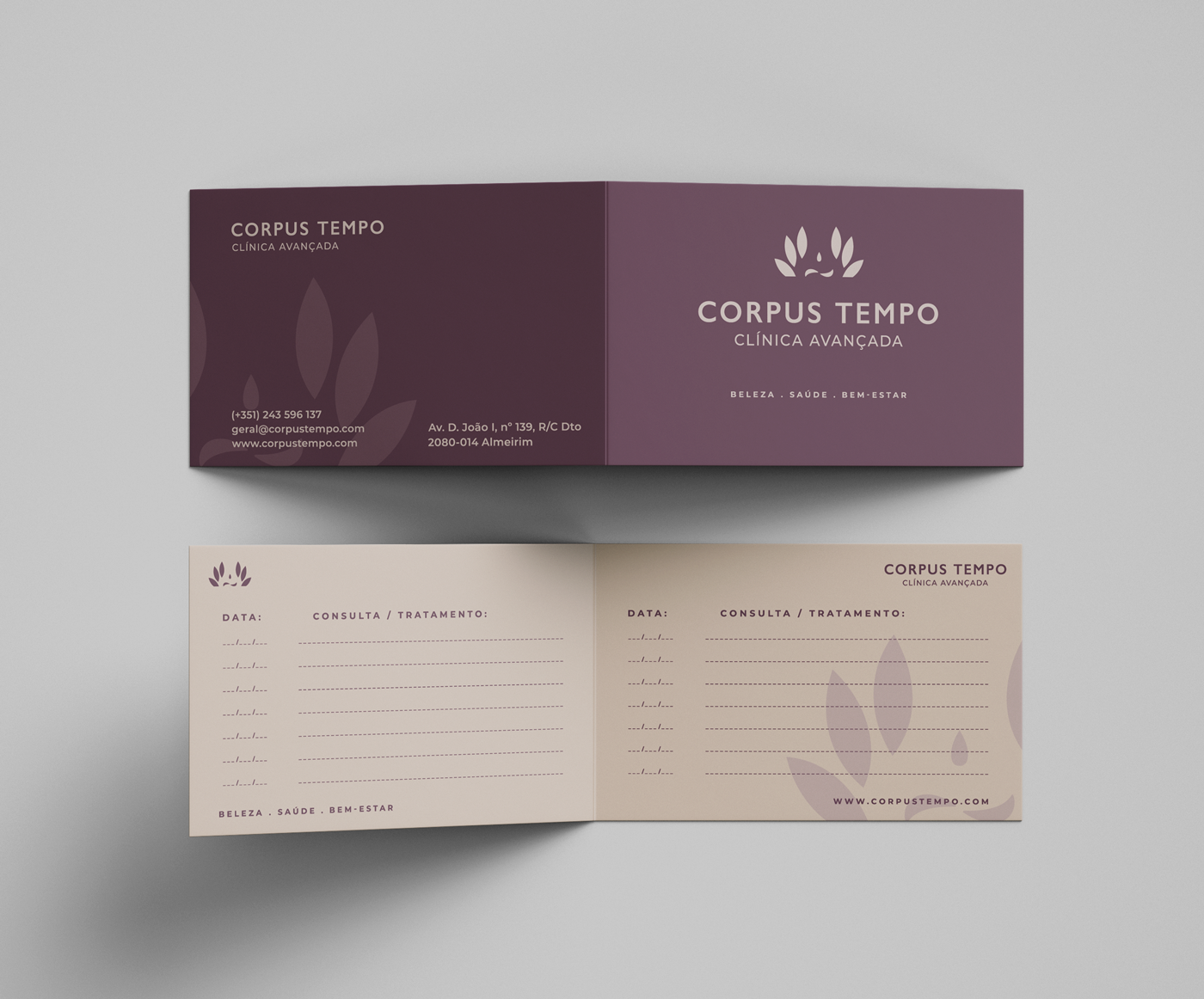
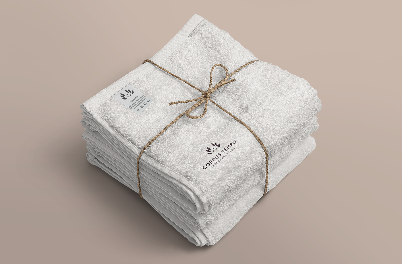
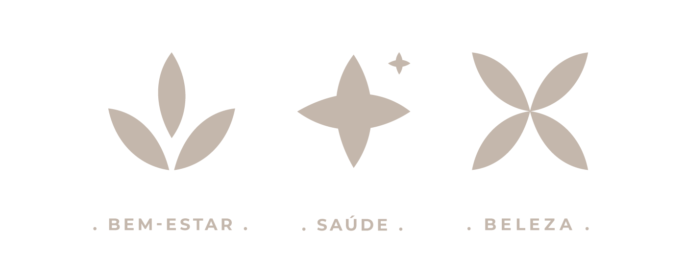
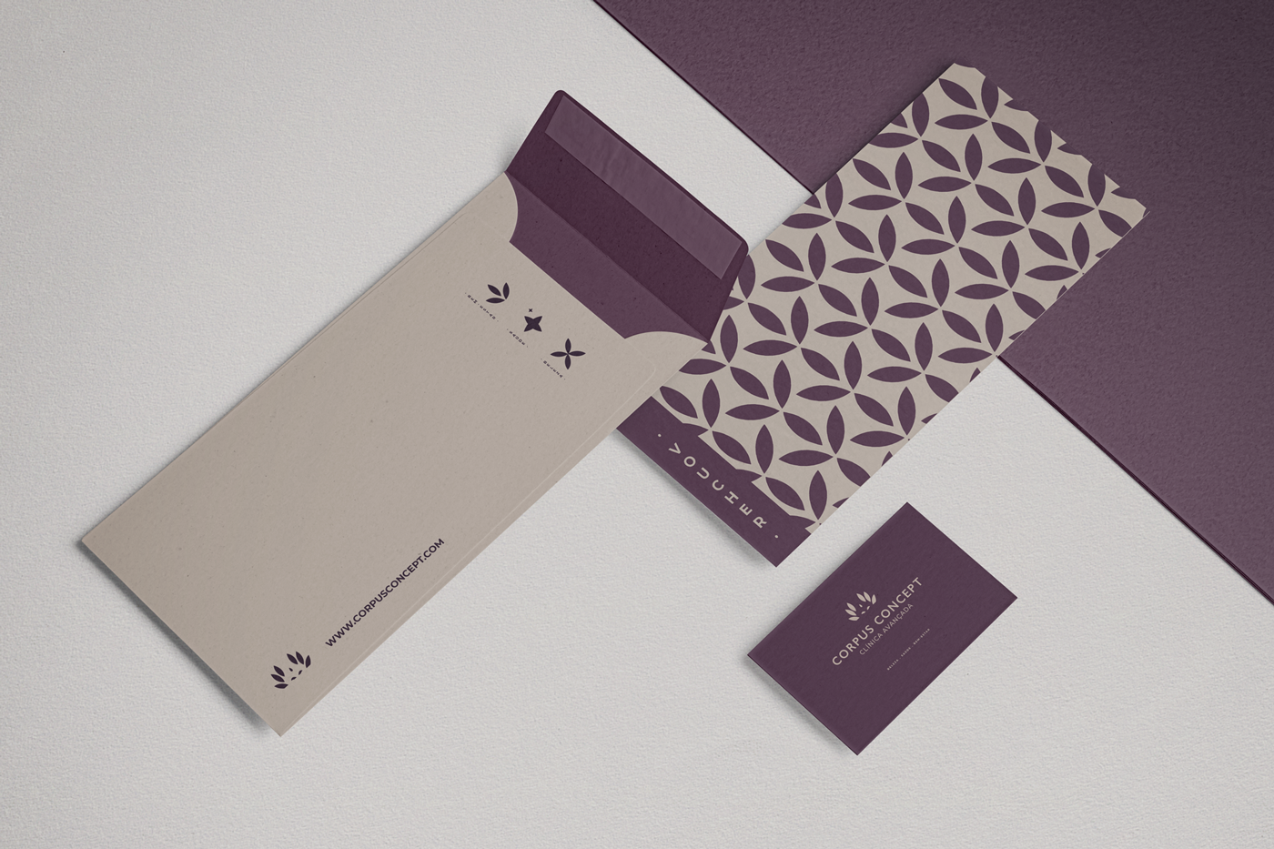
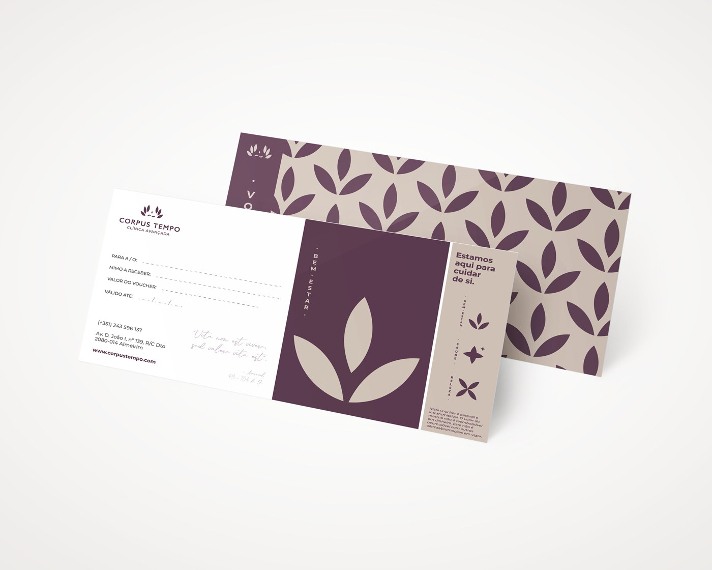
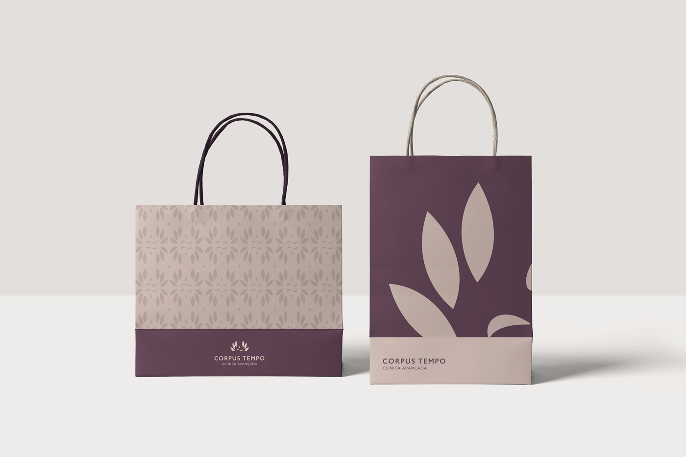
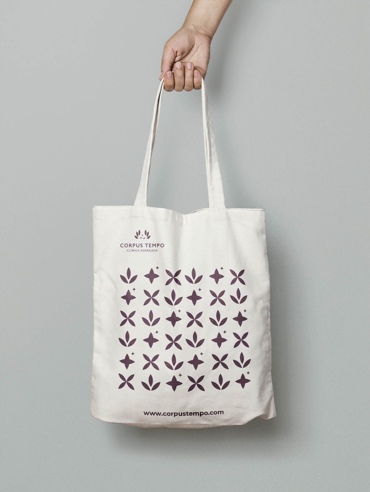
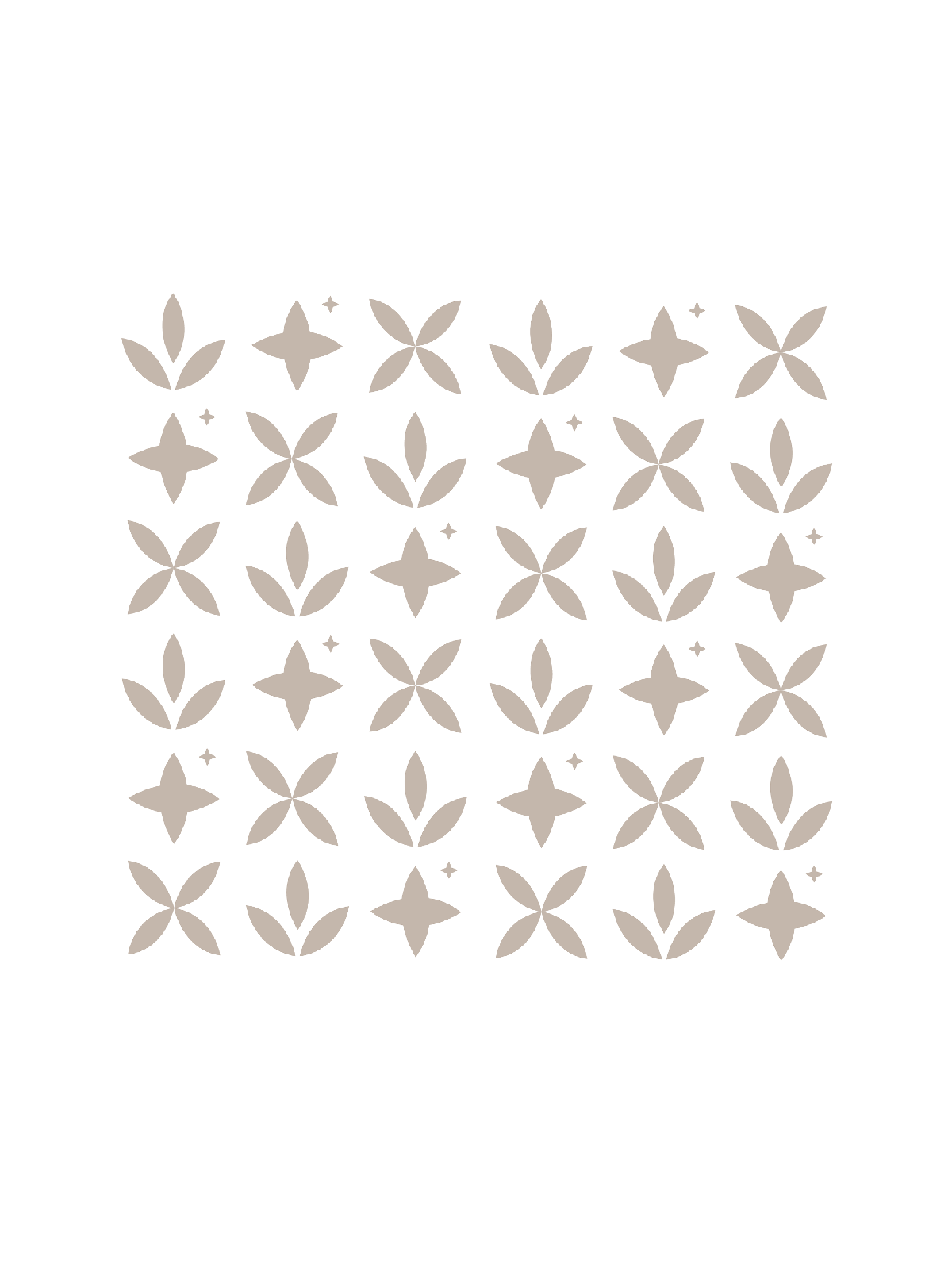
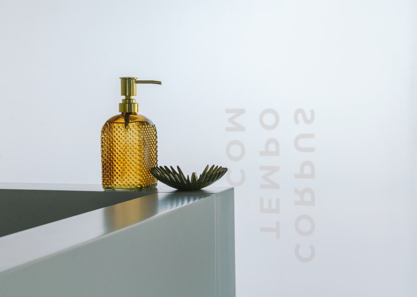
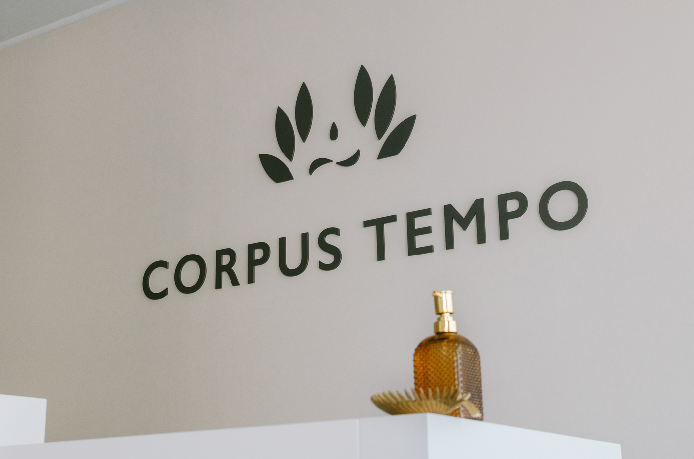
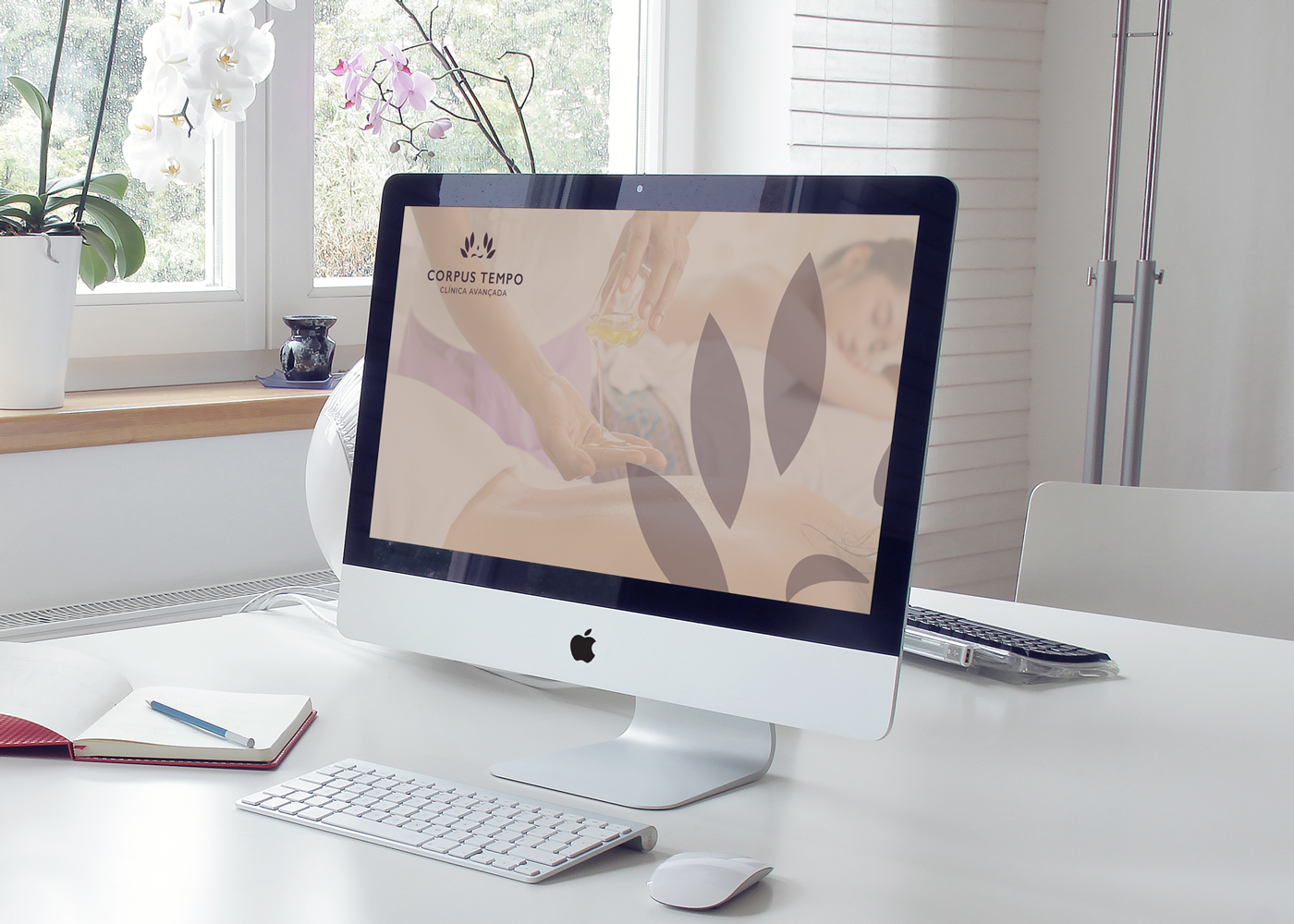
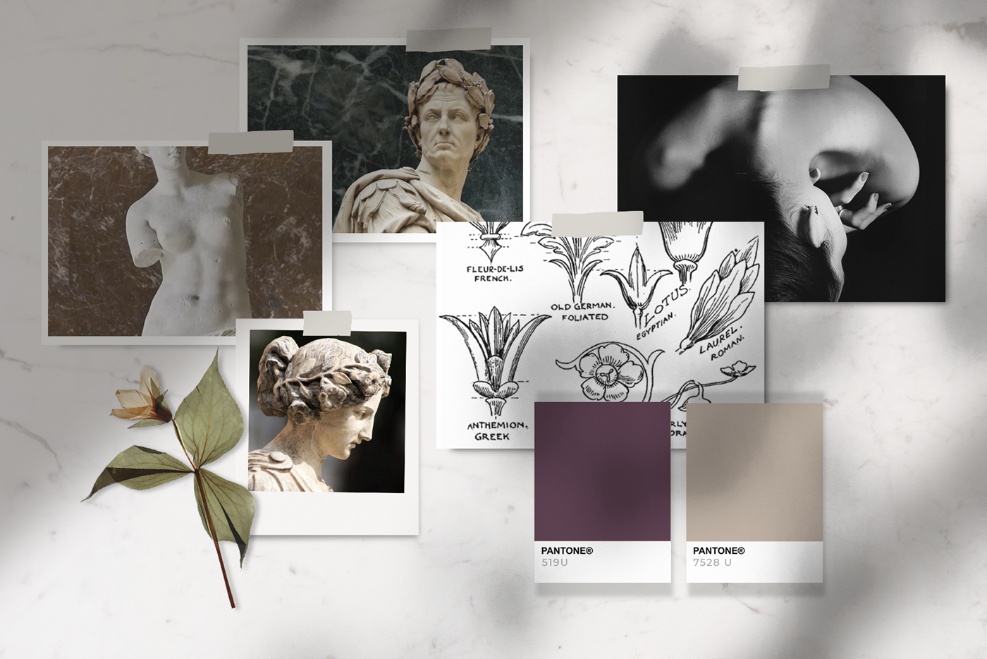
For the construction of the brand, we analyzed the origin of the name itself, the mixture between the Latin «Corpus» and the presence of «Tempo» (time) in Portuguese. Inspired by classical times, we traveled to Greek-Roman history where we went to rescue symbols and concepts that use a contextual meaning to the brand. We have presented the laurel wreath, the very shape of the body, and the concept of time 'Khrónos', when time passes through the body and can be measured chronologically. Through the symbol of eternity, we break the notion of infinity and we assume a beginning and an end. From the union of these three symbols the «Corpus Tempo» logo is born, an elegant shape, geometrically based on a circular construction, which reinforces its character and sends us a sense of perfection, union, and fullness. Keeping elegance and professionalism as premises, we have created a visually engaging brand that conquers and approaches and establishes trust with its customers. See next all the steps of building this brand and its symbolism, and meaning of its forms, elements, and colors.
—